Validation Plot Options
Scatter plot options
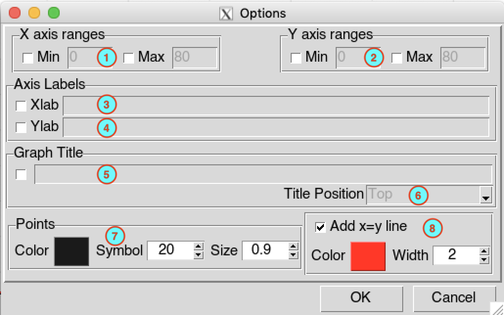
If you want to change the minimum limit of x-axis, check the box
 Min , it will activate the
input field on the right allowing you to enter the value of the minimum
limit to use. In the same way, check the box
Max to change the maximum
limit of x-axis.
Min , it will activate the
input field on the right allowing you to enter the value of the minimum
limit to use. In the same way, check the box
Max to change the maximum
limit of x-axis.The same as the x-axis, you can change the range (minimum and maximum limits) of the y-axis by checking the boxes
Min and
Max .To change the label of the x-axis, check the box
Xlab , it will activate the
input field on the right, enter the text you want as label. If you want
to remove the default label and do not want put a label, just check the
box
Xlab and leave the input field
on the right empty.To change the label of the y-axis, check the box
Ylab , it will activate the
input field on the right, enter the text you want as label. If you want
to remove the default label and do not want put a label, just check the
box
Ylab and leave the input field
on the right empty.To change the title of the graph, check the box on the left and enter the title in the input field on the right. If you want to remove the default title and do not want put a title, just check the box and leave the input field on the right empty.
If you add title to the graph, select the position where you want to put the title, at the top or bottom of the graph.
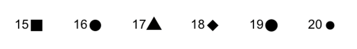
Click on the colored rectangle to change the color of the points in the scatter plot, it opens a color picker dialog allowing to choose the color. You can change the symbol used for the points by entering the value in the input field in the middle, or by increasing or decreasing it using the
 buttons on the right, you
can use 6 different symbols represented by the number from 15 to 20 (see
image below). You can increase or decrease the size of the points using
the buttons, or entering the
value you want in the input field.
buttons on the right, you
can use 6 different symbols represented by the number from 15 to 20 (see
image below). You can increase or decrease the size of the points using
the buttons, or entering the
value you want in the input field.
List of symbols (pch symbols in R)
- To add x=y line to scatter plot, check the box
Add x=y line . To change the
color of the line, click on the colored rectangle to open a color picker dialog. You
can change the width of the line by entering the value in the input
field, or increasing or decreasing it using the buttons on the right.
Line chart and CDF options
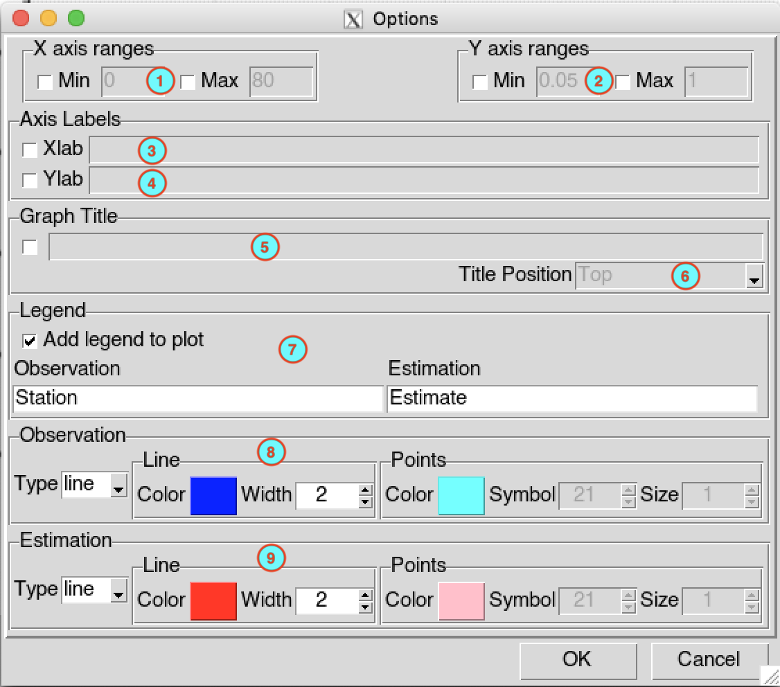
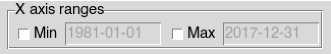
- If you want to change the minimum limit of x-axis, check the box
Min , it will activate the
input field on the right allowing you to enter the value of the minimum
limit to use. In the same way, check the box
Max to change the maximum
limit of x-axis. In case of Line chart, the limits must
be a date in the form of YYYY-MM-DD where
YYYY is the year, MM the month and DD the
day. The default input fields are as follow
To change the minimum and maximum limits of y-axis, check the box
Min and
Max respectively, and enter
the limit to use in the corresponding input fields.To change the label of the x-axis, check the box
Xlab , it will activate the
input field on the right, enter the text you want as label. If you want
to remove the default label and do not want put a label, just check the
box
Xlab and leave the input field
on the right empty.To change the label of the y-axis, check the box
Ylab , it will activate the
input field on the right, enter the text you want as label. If you want
to remove the default label and do not want put a label, just check the
box
Ylab and leave the input field
on the right empty.To change the title of the graph, check the box on the left and enter the title in the input field on the right. If you want to remove the default title and do not want put a title, just check the box and leave the input field on the right empty.
If you add title to the graph, select the position where you want to put the title, at the top or bottom of the graph.
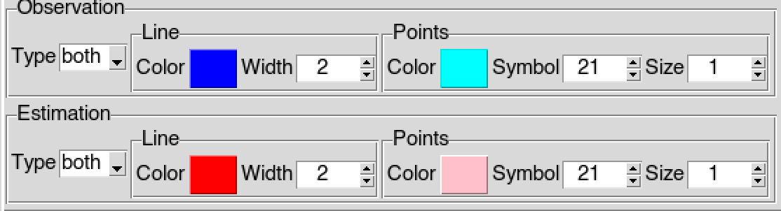
To add legend to the plot, check the box
Add legend to plot , if you do
not want to show the legend in the plot uncheck this box. Enter the text
to indicate the observation graph in the input field
Observation, the default value is Station.
Enter the text to indicate the graph of the validated data in the input
field Estimation, the default value is
Estimate.Select the type of graph to use to indicate the observation data (used to validate). You can select between line and both, the images below show the difference between of these two types of graphs. You can change the color of the line by clicking on the colored rectangle in the frame Line, you also can change the width of the line by entering the value in the input field, or by increasing or decreasing it using the
buttons. If the you
selected both for the type of graph, you change the
color, symbol and size of the point to use in the frame
Points.
| Graph type: both | Graph type: line |
|---|---|
 |
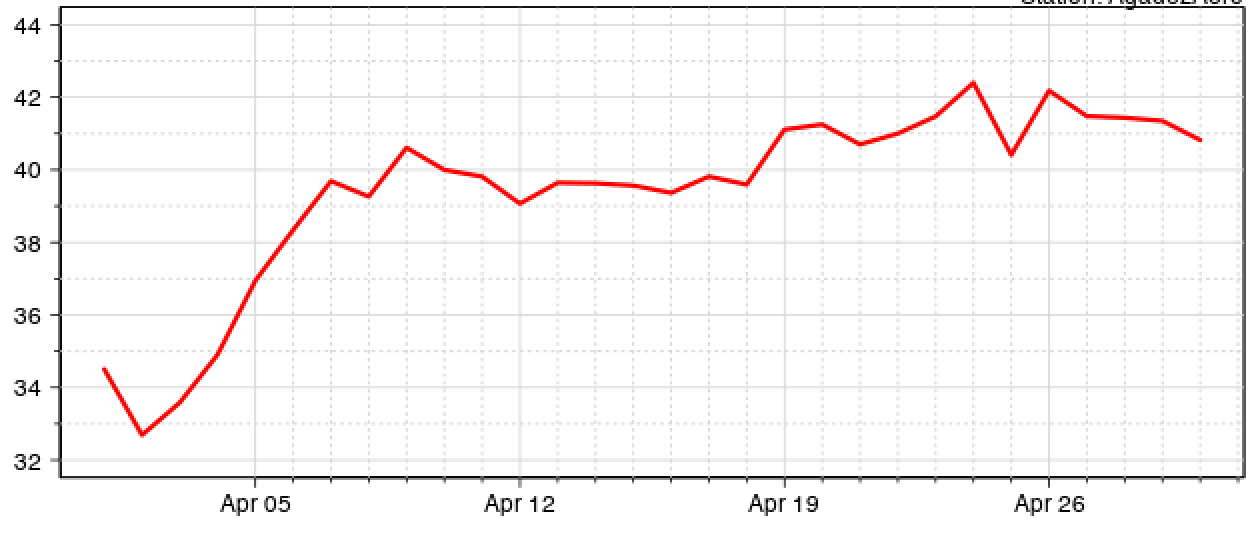 |
- You can change the properties of the graph to represent the data to be evaluated in the frame Estimation. All the properties are the same as in (8).
For example if you set the graphs properties as follows
It renders the following line charts
