Station Data Availability
To asses the availability of station data both spatial and temporal, use the menu . It will display a tabbed widget on the left panel, allows to enter the inputs data and parameters, displays a table, graphics and maps of the outputs.
The tab Input Data allows to specify the input station data.
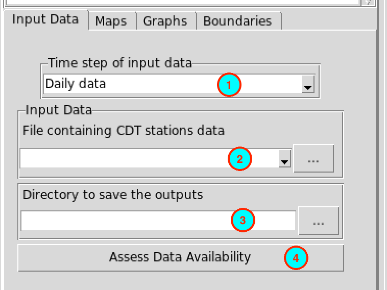
- Select the time step of the station data to assess.
- Select from the drop-down list the file containing the station data
if it is already loaded, or open it from the browse button
 on the right.
 - Type the full path to the folder to save the outputs, or use the
browse button .
- Click the button to run the assessment.
This creates a folder named ASSESS.DATA.AVAILABILITY_data under the folder you provided (3) to save the results of the assessment. Inside this folder 2 directories and 1 file are created:
- CDTDATASET: directory containing all the required files used by CDT
- CDTSTATIONS: directory containing 4 CSV files, Annual_Average_number-stations.csv: yearly average, minimum and maximum number of stations reporting data, DataAvailability_percentage.csv: percentage of non missing values for each station in CDT station data format, Monthly_non-missing.csv: number of non missing data for each station and each month in CDT station format. Yearly_non-missing.csv: number of non missing data for each station and each year in CDT station format.
- AssessDataAvailability.rds: an index file, you will need to reload the outputs of the assessment if you want to visualize the results later.
Note: Each time you perform a station data availability assessment, rename the folder ASSESS.DATA.AVAILABILITY_data or change the folder to save the outputs because CDT overwrites it.
The tab Maps allows to display a map of the percentage of non missing values and the number of non missing values for each year.
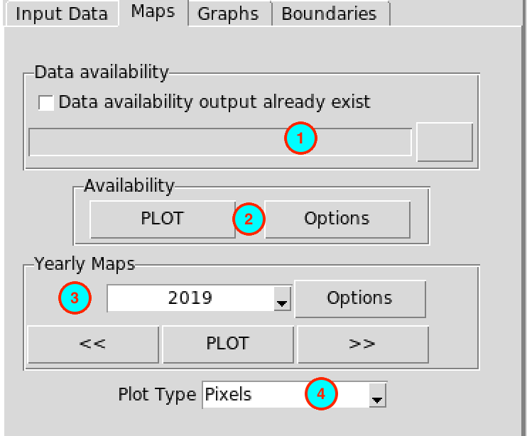
- If you already performed a station data availability assessment, you
do not need to run it again, you can check this box, the input field
below will be activated and you can provide the full path to
AssessDataAvailability.rds under the folder
ASSESS.DATA.AVAILABILITY_data by browsing it through
the button on the
right.
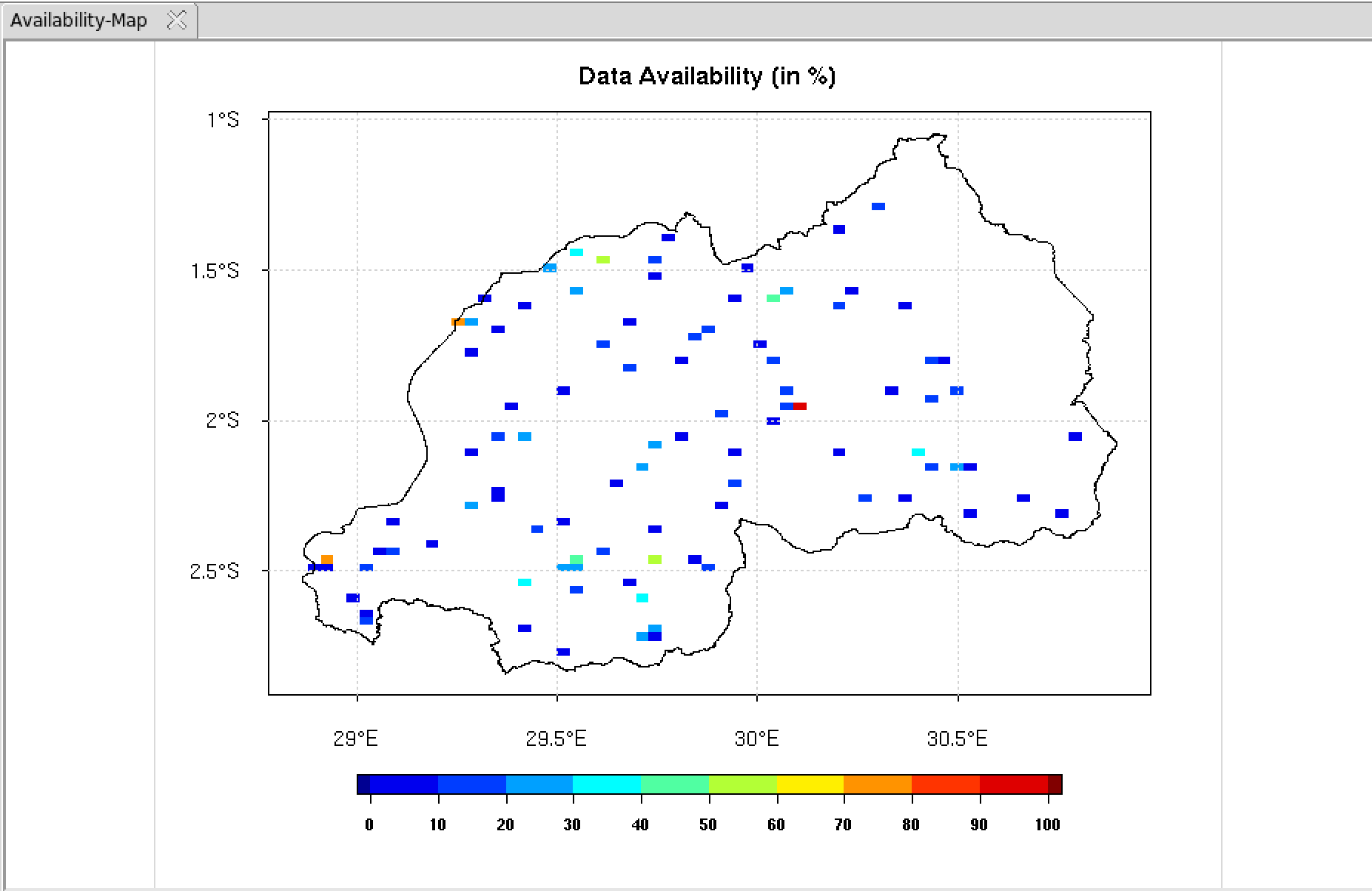
- Click on the button to display a map of the percentage of available data. The button allows you to change the colorkey settings, the label of the axis and the title of the map, see map options for more details.
- To display a map of the number of non missing value for each year, enter the year to be displayed then click on the button . You can use the buttons and to switch to the previous or next year. The button allows you to change the colorkey settings, the label of the axis and the title of the map, see map options for more details.
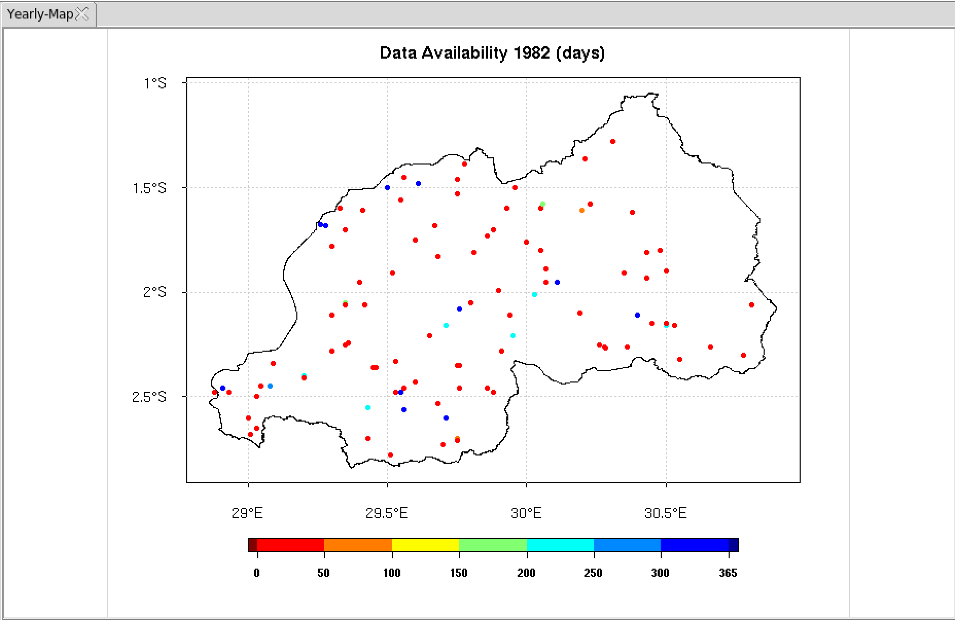
- Select the type of the map. You can choose between a pixel-based image or a points map.
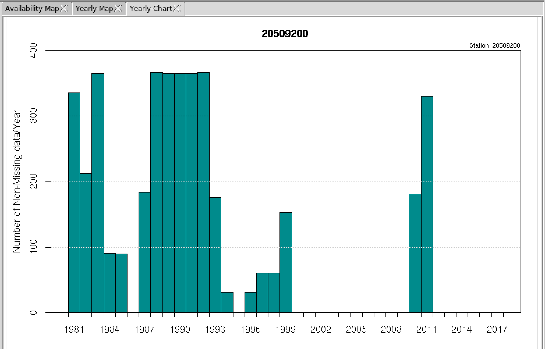
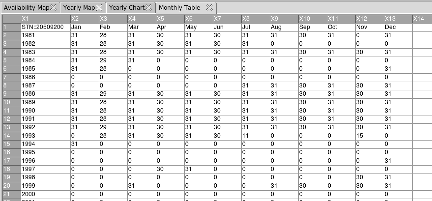
The tab Graphs allows to display a chart or table of available data, the annual average of station reporting data, and a distance-correlation graphic.
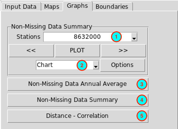
- Select here the station you want to display the chart or the table of available data. If you select the station from the drop-down list, click on the button to display the chart and for table. You can use the buttons and to switch to the previous or next station.
- Select what you want to display, chart or
table.
The chart displays the number of non missing value for each year
The table displays the number of non missing value for each month.
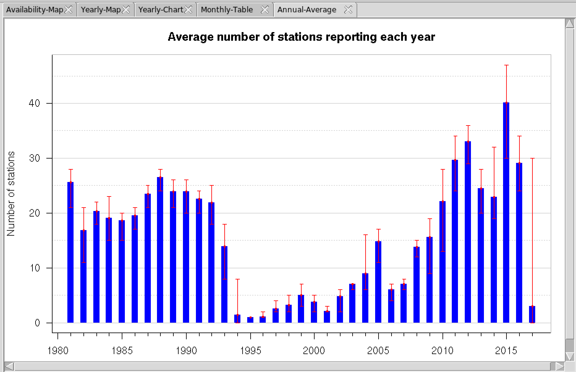
- Click the button to display a graphic of the average number of stations reporting data each year.
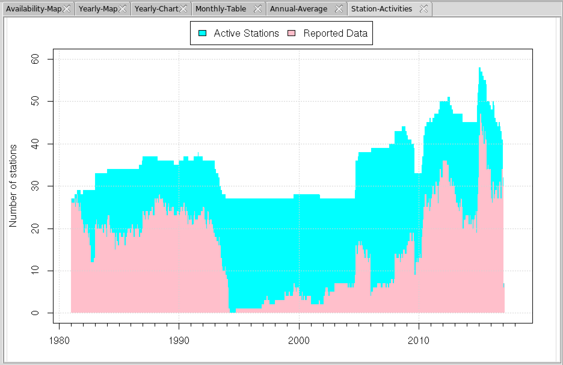
- Click the button to display a graphic of the activities of the stations. The pink area represents the number of station reporting data and the cyan area represents the number of station with missing values (the stations are supposed to be in running but not report data).
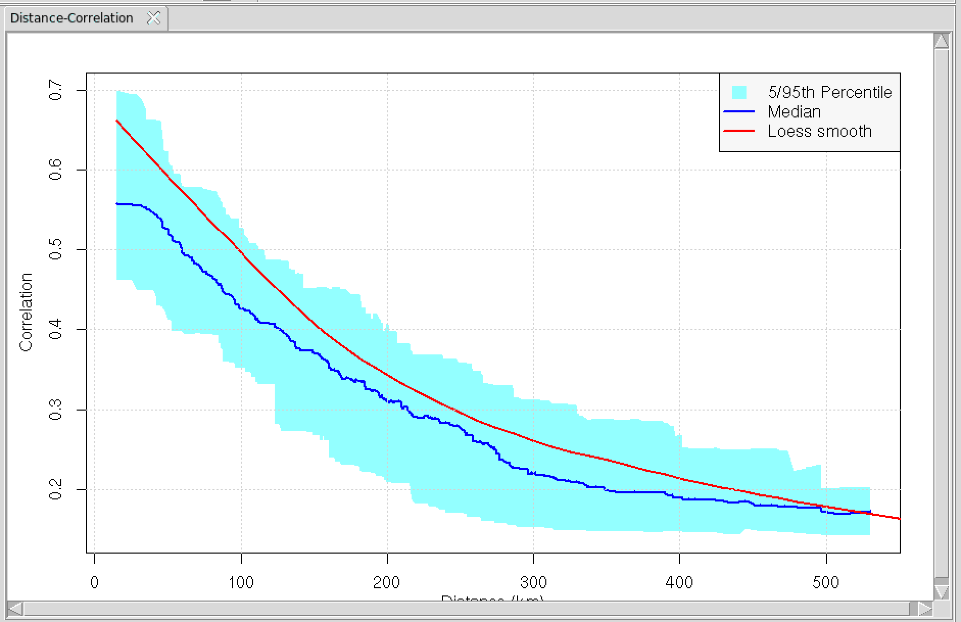
- The button displays a graphic based on distance and correlation. It allows you to have an overview on the quality of the spatial interpolation when you want to interpolate those stations data.
The tab Boundaries allows to add a shapefile on the map.
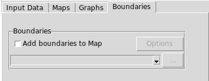
Check the box and select the shapefile from the drop-down list or
open it from to add
boundaries to the active map. Click on the button to change the width and of the
color of the lines.