Map types
Stations data
There are two main ways to represent stations data on a map: points and pixels.
For the representation with points, the stations data are splitted into an interval and each interval is represented by a dot symbol and a different colors on the map.
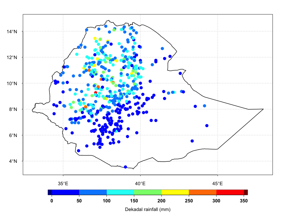
When there are a regions with high density of stations, the representation using points is not suitable. The points are overlapping and some stations are hidden behind other stations. In this case, it is better to display the station data with a pixel map, which consists of creating a grid and all stations inside each grid are averaged using bilinear weights.
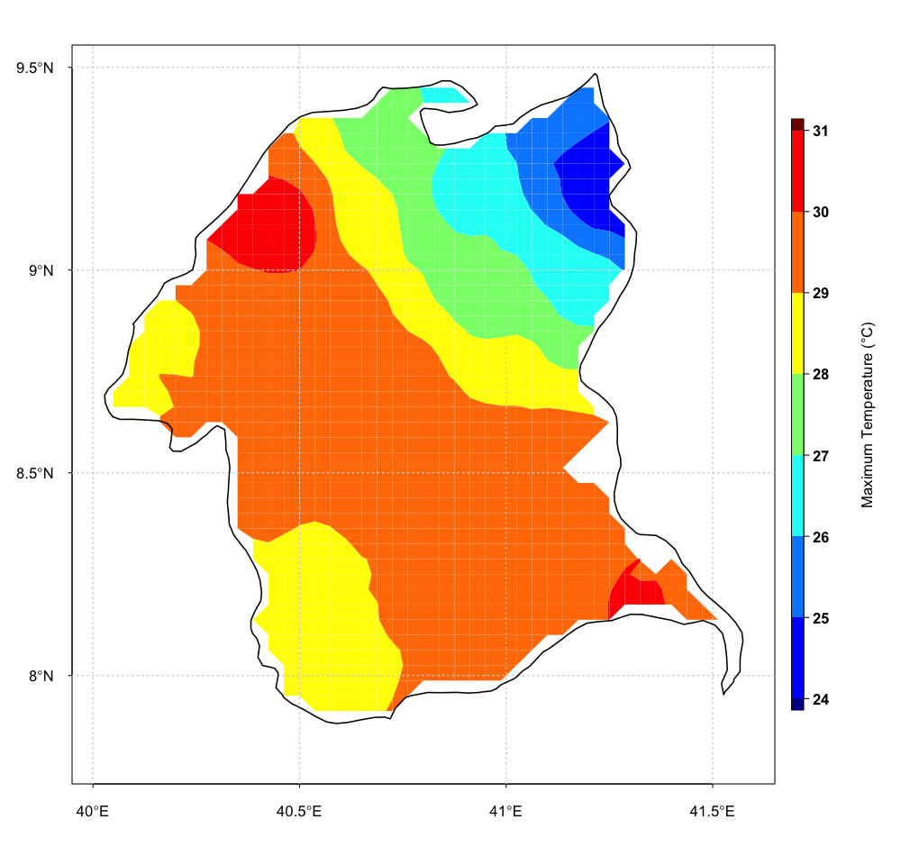
Gridded data
You have two choices to display a map of gridded data: pixel and filled contour.
A pixel map is a representation of a 2-dimension dataset with
different colors. Each pixel coordinate refers to a different value in a
dataset.
A filled contour map is a contour plot with the areas between the
isolines filled in solid color.
| Pixel | Filled Contour |
|---|---|
 |