The Truth About Verification

Forecast verification metrics can be viewed in both map and chart interfaces.
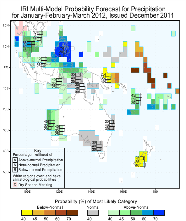
In December 2011, the International Research Institute for Climate and Society issued a seasonal precipitation forecast. The forecast called for a 75 percent chance of above normal precipitation over parts of the Philippines between January and March. As the months played out, storms brought roughly eight inches more rain than usual for the period. That’s about 85 percent more than usual.
Does this mean the forecast was right? What if the storms never materialized and the region received eight inches of rain less than normal? Would the forecast then have been wrong?
In both cases, the answer would be no. That’s because there’s no such thing as a right or wrong probabilistic forecast. A 75 percent chance of above-normal rain also implies a 25 percent chance of normal or below-normal rain.
This isn’t to say that forecasts are exempt from criticism, though. While a single forecast is tough to judge, a group can be examined to see if their probabilities are meaningful. That might mean checking to see if above-normal temperatures are more frequent when their probabilities are increased, for example. The IRI has been doing just that many years, analyzing its seasonal temperature and precipitation forecasts, which it has issued since 1997. In the past year, scientists have made those results publicly available for the first time online on a forecast verification page.
Among the many challenges to verifying climate forecasts is reconciling the fact that forecasts are issued as probabilities, while the observations of temperature and rainfall are measured as specific numbers. Staff at IRI have been grappling with this incongruity for nearly a decade. Lisa Goddard, Tony Barnston and Simon Mason first started evaluating IRI’s forecasts in the early 2000s. Their findings, published in a 2003 paper, showed IRI’s forecasts successfully indicated many of the observed increases and decreases in precipitation and temperature. They also showed that the forecasts for temperature were better than those for precipitation.
In 2010, the three scientists, along with colleagues Dave DeWitt, Shuhua Li and Xiaoafeng Gong, updated their methodology. They published an analysis that looked at five ways to measure how good the forecasts were. When the researchers applied these measures to IRI’s climate forecasts, the results confirmed those from 2003. This time, though, Barnston and Mason wanted to share the results beyond the pages of an academic journal.
They wanted forecast users to have detailed information about the quality of the forecasts. By using a number of different measures, the users can ask a range of specific questions about the strengths and limitations of the forecasts. The various graphs and maps show where and when, and in what respects, the forecasts have been good or bad since we started issuing them about 15 years ago.
They enlisted the help of Ashley Curtis, the IRI Climate Program’s coordinator, and Jeff Turmelle, head of Information Technology. Together, they worked on the challenge of how to illustrate the verification analysis in a way that would be clear not only to other forecasters but also end users.
The end result is a host of scores across five categories displayed using interactive charts and maps. Users can shuffle through different seasons and forecast lead times to see how good (or bad) the forecasts have been. They can also overlay sea-surface temperatures from a part of the Pacific Ocean affected by the El Nino-Southern Oscillation to see how one of the major drivers of regional climate patterns can affect IRI’s forecasting abilities.
Each page also has a short description of what each score measures. For technical users looking for a more in-depth explanation of how the scores are computed, Barnston and Mason also created a technical guide (pdf).
“These pages are aimed at national meteorological services to provide an example of the best practices and products they can use for their own, usually less technical, audiences,” said Curtis.
IRI’s public verification efforts are having an impact in the forecasting community. Angel Munoz, the former scientific coordinator at the Observatorio Latinoamericano, who is now pursuing a PhD at Columbia, sees these efforts as inspiration to be more transparent about his institute’s own forecasts. “IRI’s online documentation and maps clearly show IRI’s skill. It motivates us to follow these methodologies,” he said. “Hopefully the Observatorio will be able to provide similar maps for their own products in the near future.”
The benefits of forecast verification are seeping into decision makers’ processes as well. In June 2011, Mason attended a workshop to verify the seasonal forecasts of Colombia’s national meteorological services.
Tellingly, one of the people calling for such a workshop came from outside of meteorology. Salua Osorio, of Colombia’s National Institute of Health (know as INS by its Spanish acronym), had a keen interest in verifying the seasonal forecasts that INS uses in a malaria early warning system.
“The malaria early warning system is our first effort to use climate information in public health,” Osorio said. “Forecast verification serves the purpose of letting us know the degree of uncertainty when making decisions.”
In public health and other climate-sensitive fields of work, forecast verification provides a key piece of information for decision makers in deciding whether to use a forecast and how much trust to place in it. At the same time, it also gives climate scientists a sense of what aspects of the forecast have room for improvement. Armed with that knowledge, they can work towards making a forecast that’s more reliable to decision makers.
You must be logged in to post a comment.