How Good Have ENSO Forecasts Been Lately?
By IRI Chief Forecaster Tony Barnston
This post originally appeared on Climate.gov’s ENSO blog. Reproduced with permission.
One of my responsibilities as the lead ENSO forecaster at IRI is to judge how well the forecasts have matched reality. One way I do this is I go back through the archived forecasts and make graphics that compare the forecasts with actual sea surface temperature observations. I look for places where they agree and where they don’t, and try to understand what went wrong where they don’t. But eyeballing the graphs is subjective. I’m also interested in mathematically based tests, like correlation and mean error, because they tell me in a more objective fashion just how the forecast fared. The numbers don’t lie!
Each month, predictions for the Niño3.4 index (an SST-based measure of ENSO) from more than 20 dynamical and statistical (1) models are collected and posted (2), the most recent of which is illustrated in Figure 1.
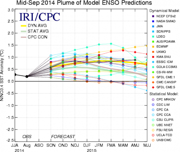
Figure 1. ENSO prediction plume issued in mid-September 2014, for the SST anomaly in the Niño3.4 region of the tropical Pacific. Observations are shown by black line on left side, for JJA season and for August. Model forecasts follow, spanning from SON 2014 through MJJ 2015. The average of the dynamical model forecasts is shown by the thick yellow line, and statistical model forecasts by the thick blue/green line. Image credit: IRI and NOAA/CPC.
In this post, I’ll talk about what the prediction models on the plume had to say over the last 2 to 3 years, compared to what actually happened. We will see that the forecasts often provided useful information for the coming few months, but have more modest accuracy and value in forecasting farther into the future. It is particularly hard to predict the timing of ENSO transitions and the correct strength. Clearly, more research and better understanding are still needed.
How Have the Forecasts Compared with Observations in 2012-2014?
Because models have different errors, using an average of the forecasts of several models is considered better than using any one individual model (Kirtman et al. 2014). To get a flavor for how good or bad the ENSO forecasts have been since 2012, we compare the average forecasts of the dynamical models (Figure 2) and statistical models (Figure 3) to the observed SST anomalies in the Niño3.4 region of the tropical Pacific.
In each figure, the orange line shows the observed Niño3.4 index for overlapping three-month seasons from January-February-March 2012 to June-July-August 2014. The three other lines show the seasonal predictions made at three different “lead times:” 1 month in advance, 4 months in advance and 7 months in advance (see footnote 3 for more explanation of lead time).
Figure 2, showing the dynamical model performance since 2012, reveals several features. There was a brief period of time around late summer 2012 where the Niño3.4 region was rather warm, and reached thresholds required for El Niño for two to three consecutive seasons—but, it was never considered a full-blown El Niño because it did not persist for very long, and there was no associated atmospheric response (a situation similar to earlier this year). Yet, the dynamical models predicted an El Niño, and only stopped doing so after SSTs in the initial conditions (4) starting cooling. The 4-month lead forecasts (blue-green line) showed a moderate-strength El Niño. However, neutral-ENSO (neither El Niño or La Niña) prevailed.
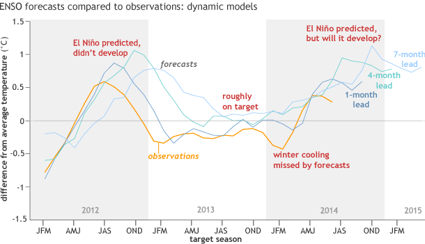
Figure 2. Mean forecasts of dynamical models for the Nino3.4 SST anomaly for overlapping 3-month periods from JFM 2012 to JJA 2014, and the corresponding observations. The observations are shown by the orange line, while the forecasts are shown by the dark blue line (1-month lead), blue-green line (4-month lead) and light blue line (7-month lead). Current forecasts extending out through early 2015 are shown. See footnote 3 for the definition of lead time. Image credit: IRI/NOAA Climate.gov.
During summer to fall 2013, the model predictions were approximately on target. However, the models missed the brief period of cooler Niño3.4 index values during winter 2013-14 (never reaching a full-blown La Niña).
Beginning in spring 2014 more warming took place, and the forecasts at both moderate (4-month) and long (7-month) leads reproduced this warming nicely: note the forecasts for MJJ 2014, where the forecasts from all three lead times and the observations coincide at index values of about 0.4°C. Rather unexpectedly though, during summer 2014 the observations cooled, while the forecasts continued to be warm. It remains to be seen whether the model forecasts will be correct in predicting a weak El Niño for the last quarter of 2014 and into 2015. It has been discussed in a previous post how several features this year were dissimilar this year to mid-2012, so we should not consider 2012 as a good description of the current ENSO predictions.
Figure 2 also shows that the dynamical forecasts often lag the observations by several months, and this lagging increases as the lead time increases. Such a lag implies a sluggishness of the models in “catching on” to new developments—they may not be predicted until they begin to show up in the observations. This lagging tendency, called “target period slippage” (Barnston et al. 2012), is also seen clearly in the brief warming in summer 2012 (5). Another feature seen in Figure 2 is that the forecasts average slightly warmer conditions than the observations during 2012-2014.
Figure 3 shows the statistical model performance since 2012. The pattern is similar to that of the dynamical models, with a few key differences:
– the statistical models predicted weaker warming during both the 2012 and the 2014 event
– the lag in the forecasts relative to the observations is slightly larger in the statistical models (for example, the behavior in late 2012), and
– the statistical forecasts, overall, averaged cooler than the dynamical model forecasts (6).
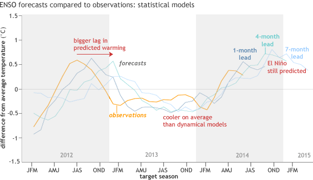
Figure 3. Mean forecasts of statistical models for the Nino3.4 SST anomaly for overlapping 3-month periods from JFM 2012 to JJA 2014, and the corresponding observations. The observations are shown by the orange line, while the forecasts are shown by the dark blue line (1-month lead), blue-green line (4-month lead) and light blue line (7-month lead). Current forecasts extending out through early 2015 are shown. See footnote 3 for the definition of lead time. Image credit: IRI/NOAA Climate.gov.
The slightly larger lag is likely a result of the fact that statistical models are often based on seasonal mean predictor data (i.e., data that is averaged over 3 months), which prevents them from detecting very recent changes in the observed conditions; dynamical models are run with the most recent observed data, and are generally run more than once each month.
Objectively, How Good were the Forecasts?
Here we consider two measurements (among many) that summarize how well the forecasts match with the observations. One is the correlation coefficient, which shows how well the pattern of the forecasts (i.e. up and downs of the time series) follows that of the observations. The correlation coefficient ranges from -1 to +1; +1 means that the observations follow perfectly what was forecast, while -1 means the observations behave exactly the opposite of what was forecast. A coefficient of 0 means that the forecasts and observations show no relationship with one another. Coefficients of 0.5 or more are often considered to show useful forecast information.
The other measure is the mean absolute error, which is the average difference between the forecast and observation (and which one is higher does not matter). Here are the results since 2012 for the two measures at 1, 4 and 7 month lead times, respectively, for the two model types:
|
Model Type |
Correlation Coefficient |
Mean Absolute Error |
||||
|
Lead 1 |
Lead 4 |
Lead 7 |
Lead 1 |
Lead 4 |
Lead 7 |
|
|
Dynamical |
0.89 |
0.60 |
0.14 |
0.17 |
0.32 |
0.44 |
|
Statistical |
0.79 |
0.46 |
0.12 |
0.22 |
0.29 |
0.31 |
As one would expect, forecasts made from farther in the past (longer lead times) are less skillful than more recent (short-lead) forecasts, and the 7- month lead forecasts were of little use over this particular period. The dynamical models showed somewhat higher (i.e., better) correlations than the statistical models. The mean absolute error is generally larger for the dynamical models, partly because they averaged too warm during the period, especially when they predicted the warmest SST levels (7). The better correlations of dynamical models were also found in the 11-year period of 2002-2012 (Barnston et al. 2012). Based on the objective performance measures, it is clear that while our ENSO forecasts can be helpful for the coming few months, we have a long way to go in improving their performance and utility beyond that. It is especially hard to predict the timing of ENSO transitions and the correct strength.
Footnotes
(1) Dynamical prediction models use the physical equations of the ocean and atmosphere to forecast the climate. Statistical models, by contrast, do not use physical equations, but rather statistical formulations that produce forecasts based on a long history of past observations of (a) what is being predicted (e.g., the Niño3.4 SST anomaly), and (b) relevant predictors (e.g., sea level pressure patterns, tropical Pacific subsurface temperatures, or even the Niño3.4 SST itself). It detects and uses systematic relationships between those two sets of data. Statistical models came into existence earlier than dynamical models, because the dynamical ones require high performance computers that have only been around during the last decade or two. Dynamical models, in theory, should deliver the higher accuracy between the two types, but they are still plagued with specific problems that are beyond the scope of this post.
(2) This plume of forecasts is posted on the IRI site on the third Thursday of the month, and is also shown, along with additional ENSO information, in CPC/IRI ENSO Diagnostic Discussion early in the following month. The discussion, in addition to providing a narrative summary of the current and predicted ENSO state, contains an official probability forecast of the ENSO condition for the 9 forthcoming overlapping 3-month periods. This forecast is based partially on the forecasts of the plume among several other key inputs, including the expert judgment of a group of forecasters.
(3) An example of a 1-month lead forecast is a forecast for JFM 2012 that was developed during the first part of January 2012, based on observed data running through the end of December 2011. Due to the time required for data collection among many different national and international agencies who finish running their models at different times, the 1-month lead forecast for JFM 2012 does not appear on the Web until the middle of January even though it does not use data from that month. The 4-month lead forecast for JFM 2012 had been issued in the middle of October 2011, and the 7-month lead forecast had been made in mid-July 2011. Describing the lead time from the point of view of the time the forecasts are made, the 1-, 4-, and 7-month lead forecasts made in January 2012 were for JFM, AMJ and JAS 2012, respectively. The month fromwhich forecasts are made is often called the start month, and the season that the forecast is for is often called the target season.
(4) Dynamical models begin their forecast computations using the latest observations. These observations include many fields (e.g., SST, sea temperature below the surface, atmospheric pressure at the surface and extending into the upper atmosphere, winds, humidity); all of these together are called the initial conditions.
(5) The lack of a lag in the predictions of the 2014 warming may be due to the subsurface sea temperatures having warmed greatly early in the year, serving to predict surface warming at a later time (Meinen and McPhaden 2000; McPhaden 2003).
(6) The somewhat muted warming in the statistical predictions is due to the typically conservative behavior of statistical models, as they often seek to minimize squared errors. This would also show up as somewhat muted cooling during episodes of La Niña.
(7) Note that the mean absolute error may be degraded without the correlation being degraded. For example, if the forecasts are always far too high (but by about the same amount), or if the forecasts are always far too strong, both for warm and for cold episodes (but by about the same factor), the correlation can still be very high but the mean absolute error may be terrible (very high). But if the correlation is poor, it is difficult for the mean absolute error to look good either.
References
Barnston, A. G., M. K. Tippett, M. L. L’Heureux, S. Li, and D. G. DeWitt, 2012: Skill of real-time seasonal ENSO model predictions during 2002-11: Is our capability increasing? Bull. Amer. Meteor. Soc., 93, 631-651 (free access).
Kirtman et al., 2014: The North American Multimodel Ensemble: Phase-1 seasonal to interannual prediction; Phase 2 toward developing intraseasonal prediction. Bull. Amer. Meteor. Soc., 95, 585-601 (free access).
McPhaden, M. J., 2003: Tropical Pacific Ocean heat content variations and ENSO persistence barriers. Geophys. Res. Lett., 30, 2003. DOI: 10.1029/2003GL016872.
Meinen, C. S., and M. J. McPhaden, 2000: Observations of warm water volume changes in the equatorial Pacific and their relationship to El Niño and La Niña. J. Climate, 13, 3551-3559.
You must be logged in to post a comment.