Maps Made For Disaster Management

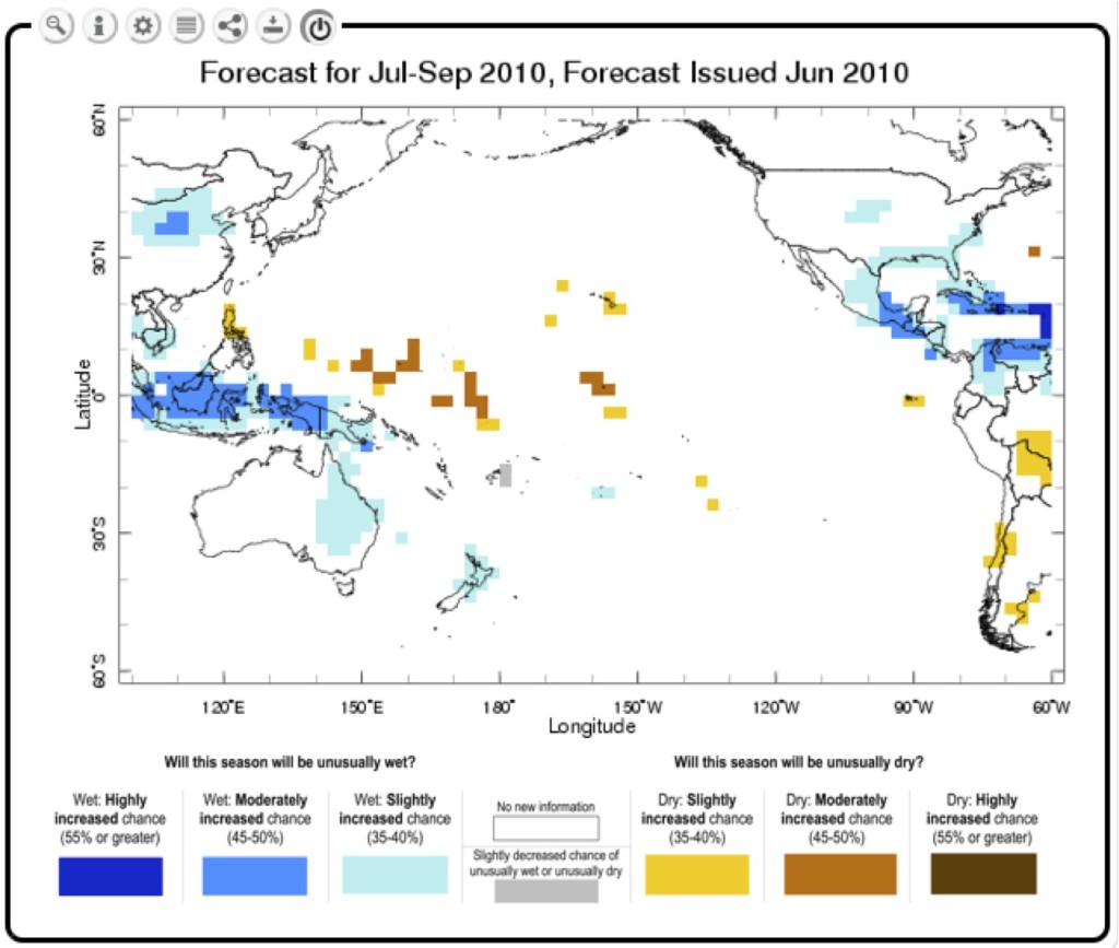
This June 2010 seasonal climate forecast generated by the IRI/IFRC Maproom showed a greatly increased chance of dry conditions for some Pacific Island nations. National Red Cross societies used this information for drought preparedness actions.
On an ongoing basis, Rebecca McNaught, the Red Cross/Red Crescent Climate Centre’s senior climate advisor for the Pacific region, looks up climate and weather forecasts for her corner of the world. To get this information, she uses an online Maproom developed by the IRI specifically for the International Federation of Red Cross and Red Crescent Societies. As its name suggests, the Maproom is collection of easy to use, interactive maps that can give McNaught and her colleagues a quick and clear sense of what’s to come–information such as the likelihood the next three months will be unusually wet or dry, for example, or where exceptionally heavy rainfall is expected in the next six days. Armed with such information, humanitarian professionals can take action before disasters strike, ultimately saving lives and property.
“Normally, I would have to open around 10-15 different web sites to get a picture of what’s going on when there is severe weather across the region,” says McNaught. “There is a lot of technical language to sift through just to get the basics.”
She says she keeps returning to the maproom because it gives a good, clear overview “that then helps give me a heads up on where I need to investigate further.”
Maarten van Aalst, the Red Cross/Red Crescent Climate Centre’s director, says the tool has been a huge asset to the Red Cross. “Not only in Geneva, where the disaster management department checks the near-term forecasts on a daily basis, but also in the field, where people have been receiving seasonal forecast information and taking action to combat food insecurity, health and flood risks,” he says.
McNaught recalls what happened back in June 2010. Checking the maproom’s seasonal rainfall forecast for that time period, she noticed a greatly increased chance of dry conditions in the coming three months for some Pacific Island nations.
McNaught shared this forecast with the IFRC’s Pacific Regional Office and worked with a training officer there, Viliame Tuimanu, to adapt this information for the National Red Cross Societies in every country in the region. Those in Kiribati and Tuvalu, for example, responded by working with their national meteorological agencies and other government partners to start drought preparedness actions. Kiribati conducted an awareness campaign to prevent an increase in typhoid, a disease which often spikes during drought conditions. In Tuvalu, which is very dependent on rain for its fresh water, the national authorities made radio announcements to encourage water conservation and advertise the availability of water for purchase from the government in anticipation of possible drought-related shortages.
Developed in 2008 as part of the IRI/IFRC Partnership to Save Lives, the IRI/IFRC Maproom provides understandable and actionable climate and weather products to inform Red Cross disaster preparedness efforts worldwide. Now, with support from the U.S. Agency for International Development and the US National Oceanic and Atmospheric Administration, IRI has extensively upgraded the tool, incorporating five years’ worth of feedback from users. In the past year, nearly 3,000 visitors from 139 countries have used the Maproom.
In addition to existing weather and seasonal climate forecasts, IRI added new maps that show rainfall patterns typical during El Niño and La Niña events, and ones that show how rainfall and temperature have varied over the past 100 years for every spot on the globe. Also, when users click on a country, the name of the country now appears in a pop up window, a feature useful for identifying far flung islands in the Pacific, for example.
“We improved usability by focusing each page on the question it is answering, adding suggestions for early actions to reduce possible disaster effects, and using tabbing to organize additional information,” says IRI’s Benno Blumenthal, who lead the redesign. “We also increased the functionality–the pages are smartphone and tablet compatible.”
Newly added sharing features allow one-click sharing via email, Twitter, Facebook and more. Users can also send maps into software such as Google Earth and ArcGIS. There’s even a Spanish-language version of the map room. For a brief guided tour of the new features, watch the video embedded below.
Tour of the Federation Maproom from IRI on Vimeo.

You must be logged in to post a comment.