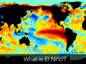
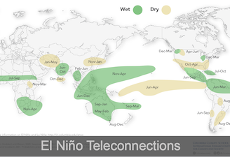
The El Niño Southern Oscillation (ENSO) phenomenon contributes significantly to seasonal climate fluctuations in many regions of the globe, often with social and economic implications for human populations and the environment.
This site provides details of the current forecast status of ENSO conditions, as well as background information on both the physical phenomenon and some of its associated impacts.
Click Here for the Current ENSO Forecast

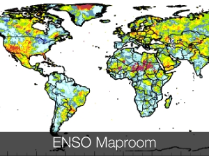
You can access the ENSO Rainfall Probability Related Data from the Data Library.
You must be logged in to post a comment.