Malaria in Madagascar
As a preliminary study aiming at relating malaria in Madagscar with climate information, I show here a short analysis of malaria incidence variability. The seasonal cycle is shown thanks to a cluster analysis of the yearly climatology, and the year-to-year variability through a Singular Value Decomposition (SVD) of the anomalies. Because our cluster analysis can't deal with gaps in the data, I previously fill the few gaps with the reconstruction of an SVD performed on the malaria incidence available from January 1993 to December 2005.
Gap-filling
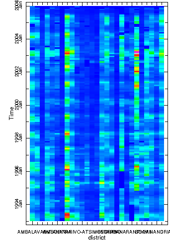
The SVD decomposes a signal into different component or structures that optimize the explained variance of the original signal decreasingly. That means that the first structure represents the most variance of the original signal, the second the second largest variance and so on. The method was created in order to reduce the size of a dataset to ease its study by focusing on its first modes only. It is also a good tool to provide insight into spatial and temporal variations exhibited in the fields of the signal being analyzed. Mathematically, the recomposition of all structures give back the original signal. In this case where gaps are short and few, I use this technique to fill the gaps. The gaps only are replaced by the value of the recomposition from SVD structures. The graphs below give some insight into the quality of the gap-filling.
The difference and RMS show relatively small errors. The difference being all negative shows the difficulty for the SVD to catch extreme events.
 |
 |
 |
 |
 |
 |
 |
 |
Figure 1 - From top left clockwise: original data; reconstructed from SVD; RMS between original and reconstructed district wise; difference between original and reconstructed.
The seasonal cycle
A 2-cluster analysis actually reveals the geographical pattern of the island. Cluster #2 corresponds of the highlands where transmission is unstable, and cluster #1 corresponds to the margins of the highlands. Both cluster show a strong seasonal cycle with a peak in incidence in April and dip in September. The difference between the two clusters actually resides in the average incidence which is much higher in cluster #1 than in cluster #2. Cluster #1 also experiences higher amplitude of its seasonal cycle.
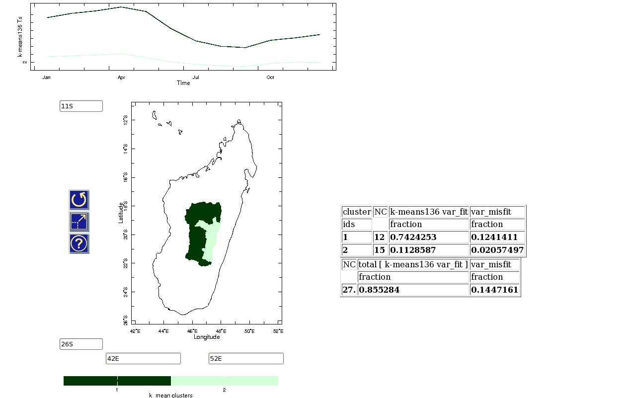
Figure 2 - 2-cluster analysis of malaria incidence yearly climatology.
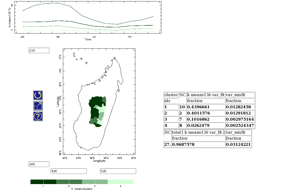
A 4-cluster analysis reveals some further details within the two original clusters. Especially, it shows how two districts concentrate 40% of the total variability (cluster #2) with the most ample seasonal cycle and the highest mean incidence. Also, half of the districts of the original cluster #1 concentrate almost all the total variability of that cluster (cluster #3 about 10%).
Year-to-year variability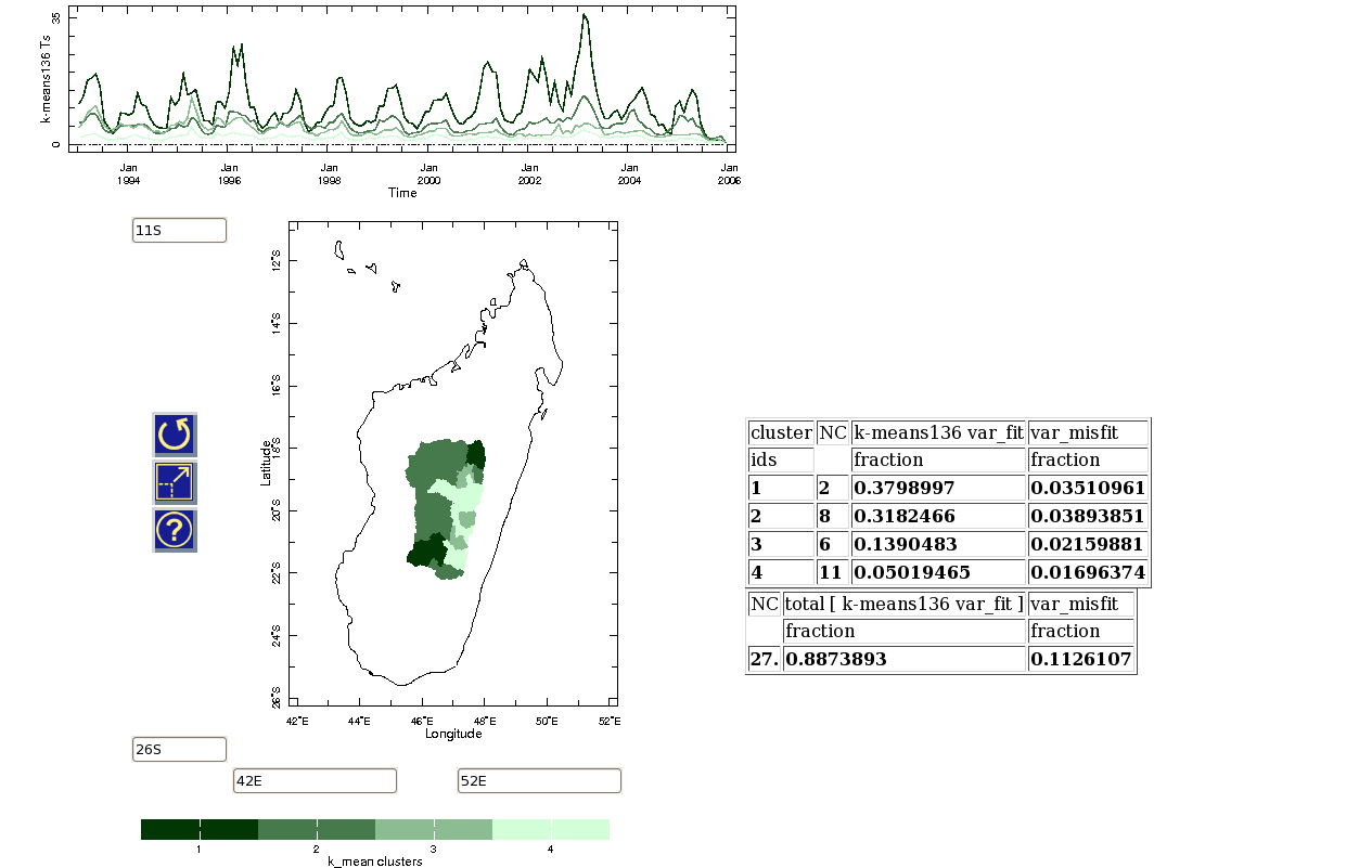
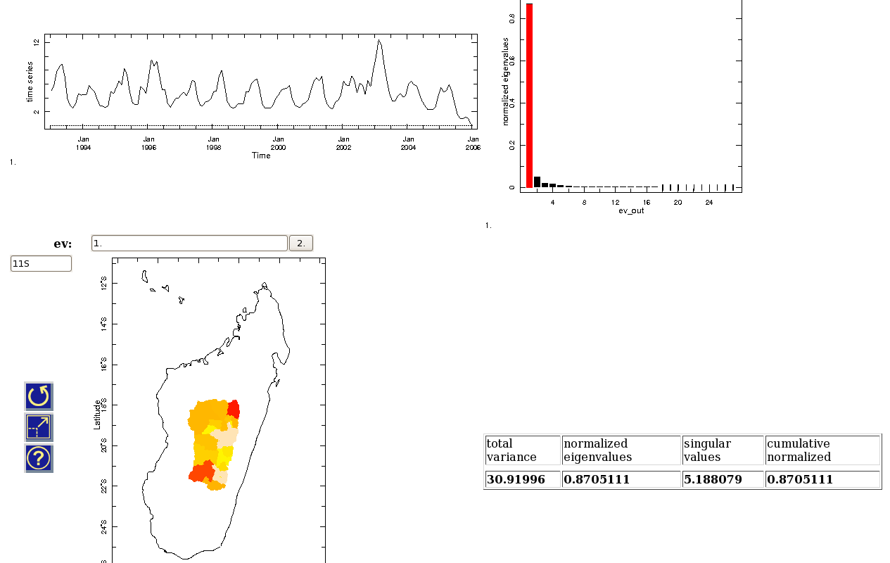
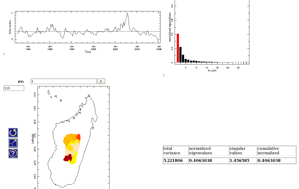
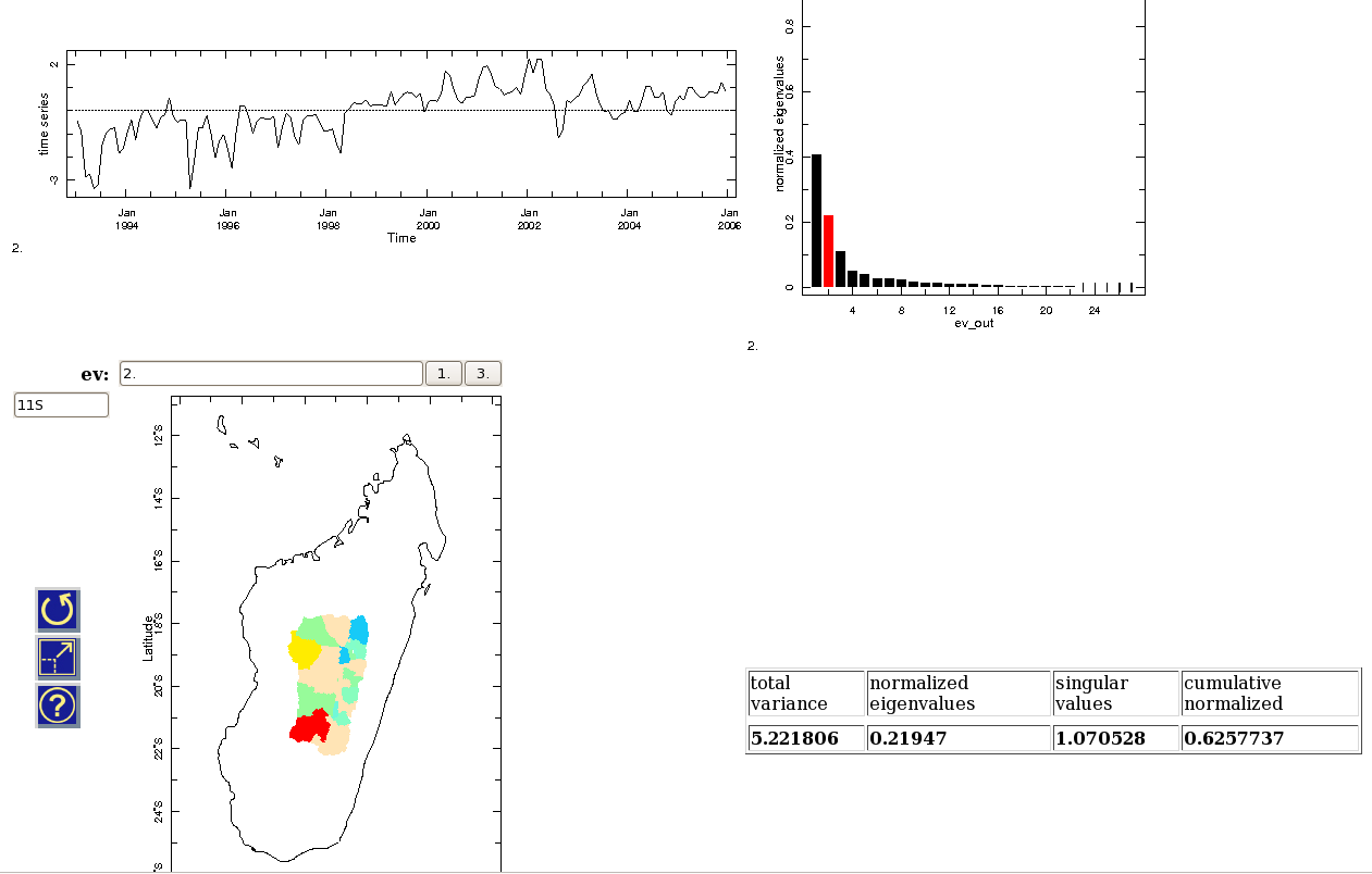

Figure 3 - 4-cluster analysis of malaria incidence yearly climatology.
Year-to-year variability
Before removing the seasonal cycle, the 4-cluster analysis shows, in its time series and in its geographical distribution, that the seasonal cycle is the prevailing signal in the data. The time series show clearly a seasonal cycle and how different clusters represent a more or less important mean incidence or variability. The geograhical pattern is the same as the seasonal cycle one, which pretty much means that the seasonal cycle drives here the cluster analysis. We therefore need to remove the seasonal cycle to capture the year-to-year variability. Still we can point out major events in 1996 and 2003; more than usual events in 1995, 2001 and 2002; and the unusually still high conditions in September 2002, when it is supposed to be a dip.

Figure 4 - 4-cluster analysis of malaria incidence.
Here is the first mode of an SVD performed on the malaria incidence. It shows again that 87% of the variance is explained by the seasonal cycle. The time series also shows the year-to-year anomalies we would like to understand. The map confirms the geographical repartition of intensity and variability.

Figure 5 - Mode 1 of the SVD of malaria incidence.
Removing the seasonal cycle, the cluster analysis has some troubles forming clusters and tends to quickly individualized each district. If the clustering can't really clusterize, let's move back to the SVD. The first mode of the SVD confirms the irregularities detected earlier on the year-to-year basis. The map shows that all districts are in phase and points out which one are the most affected by these irregularities. Again the South-Westernest districts are the most affected, then the North-Easternest and eventually a Northern stripe of districts.

Figure 6 - Mode 1 of the SVD of malaria incidence anomalies.
The second mode, which doesn't much of the total variability already, seems mostly to indicate what differentiate the SW districts from the NE ones. The latter might have bigger events in the pre-2000 era whereas the former might have experienced bigger ones in the post-2000 era.

Figure 7 - Mode 2 of the SVD of malaria incidence anomalies.